Patons Insurance is an independent, family-owned insurance broker specialising in taxi and fleet insurance, and is part of the Patons Group. As part of their growth strategy and addition of new niche insurance services, Patons approached us to refresh their brand identity, a decade since we designed their previous logo.
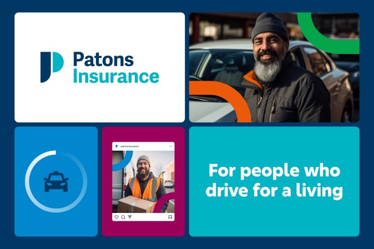
Following an extensive brand articulation process and tone of voice development involving key stakeholders, we repositioned Patons as the go-to broker ‘for people who drive for a living’. Established in 1972, the new logo harks back to Patons’ roots, reviving a fondly remembered symbol which was used throughout their beginnings in Glasgow in the 1980s. Retaining the familiar brand colours, the logo references both a letter J and P, representing the full company name, John Paton (Insurance Services) Limited.
The new identity will roll out via a new website, brand guidelines, office signage, and printed collateral, with more to follow.